VISUAL BRANDING AGENCY
ROLE
Brand Strategy
Creative Direction
Identity System
Graphic Design
Brand Photography
LESTINA CREATIVE
Lestina Creative is an Arizona-based visual branding agency, specializing in brand photography and videography.
I helped them establish a refined luxury identity that elevated their brand positioning and cohesively aligned with their sister company.


Approach
01: Brand Foundations Exploration
Using our Brand Foundations Questionnaire as a starting point, we gathered key information on Lestina Creative: their background, goals for their business, target audience demographics, and more. Co-founder Karlie found this step to be “one of the most valuable pieces to working on our brand identity.”
02: Research
Using the information from phase one, we researched four of Lestina Creative’s main competitors in their market. We analyzed their online presence, strengths and weaknesses, and presented some key takeaways on how we can use Lestina Creative’s brand identity and implementation to elevate them above these key competitors.
03: Mood Board
Using textures, colors, fonts, imagery, and other sources of inspiration collaboratively gathered alongside the Lestinas, we built a mood board that showed the direction we felt strongest represented the strategic approach and personality we wanted the brand to embody.
04: Iterate
We spent a significant chunk of time exploring family crests, meanings behind symbols, sketching, re-sketching, and building out concepts digitally until we got to a direction that we felt embodied the spirit of Lestina Creative.
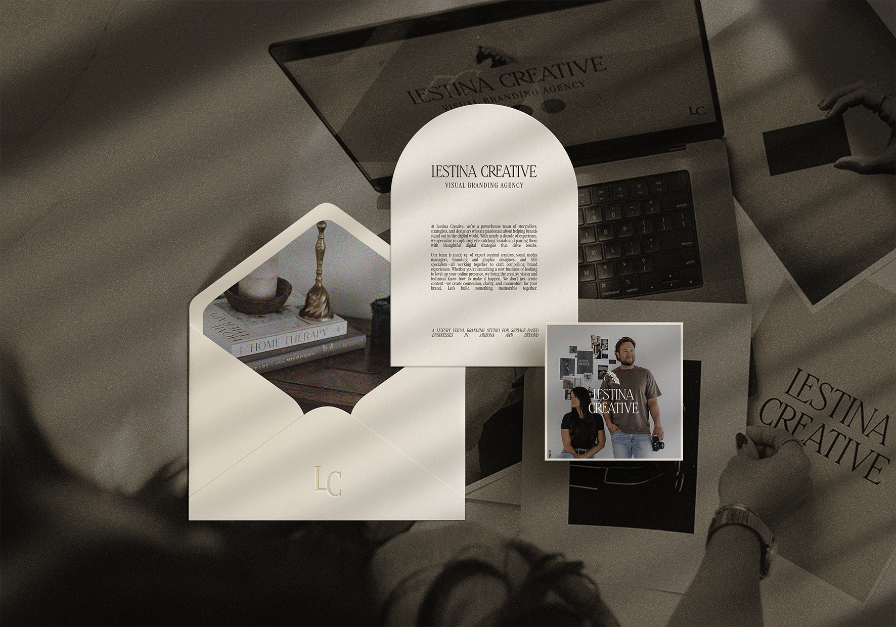
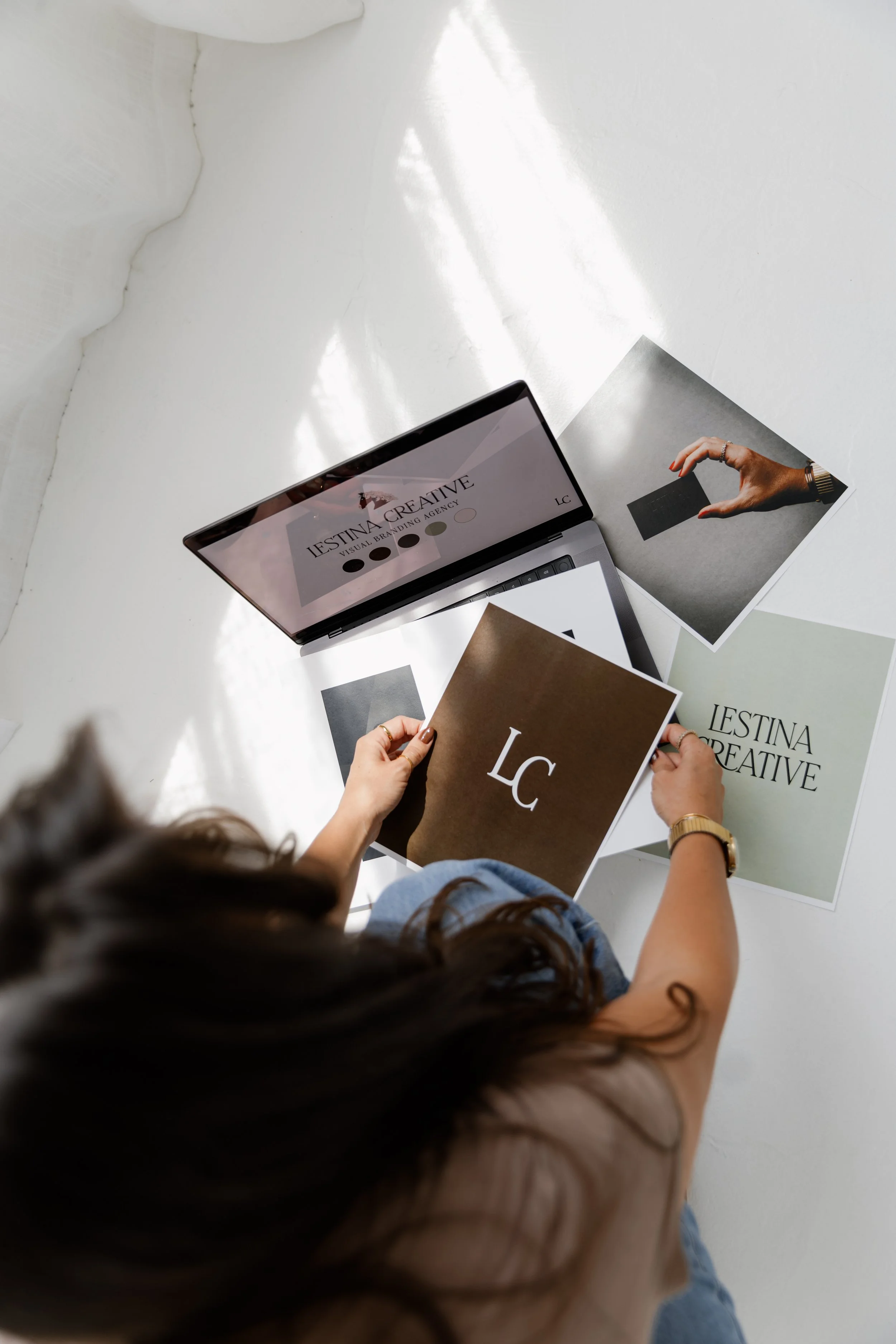
05: Create Visual Suite
We built out a robust suite of logos for different spaces, scenarios, and applications, along with a custom typeface palette and a color palette that felt cohesive with their sister company’s branding.
06: Applications
We applied their branding to business cards and two investment guides for prospective clients. These strategic improvements present them well to clients that align with their target niche.
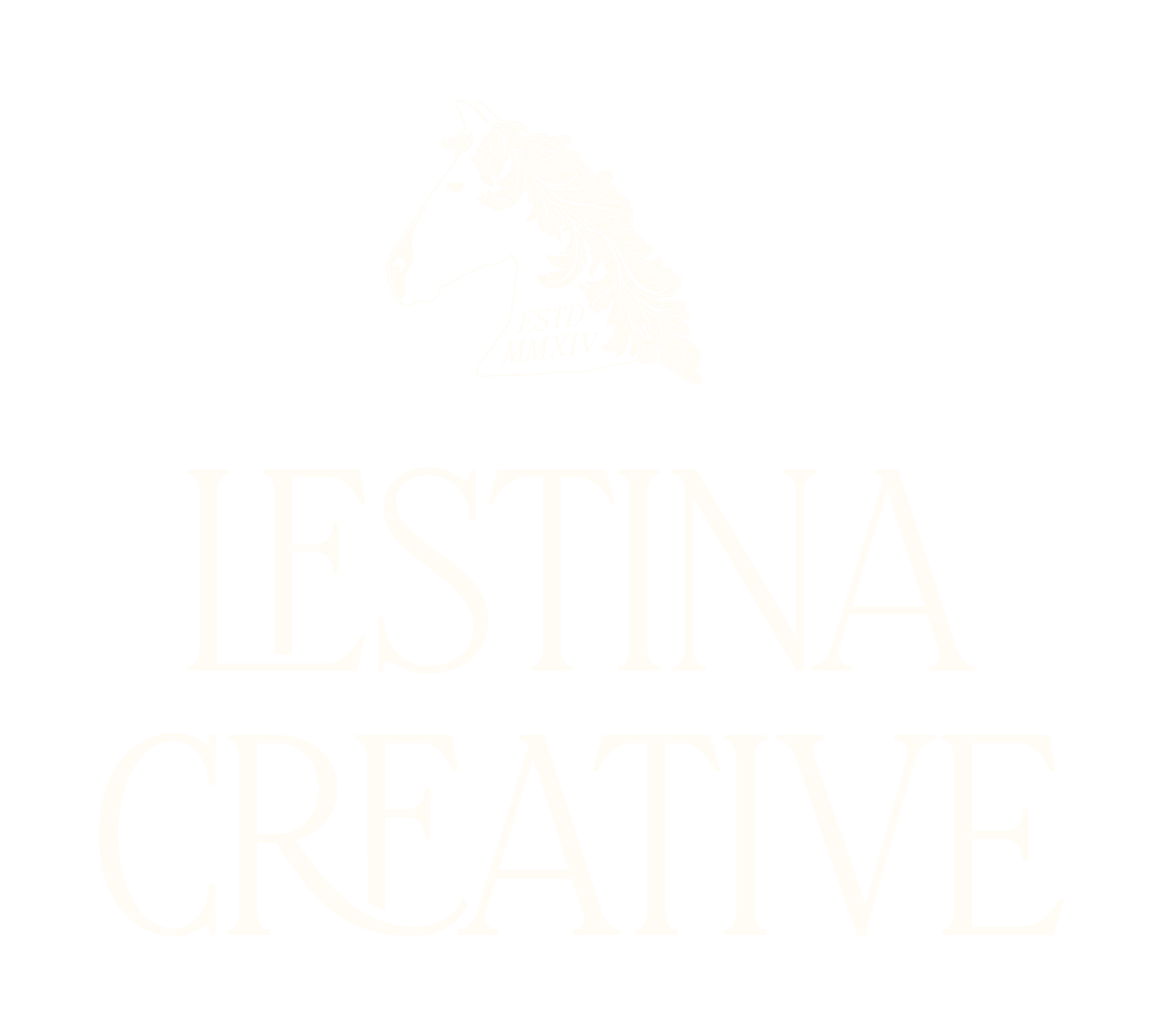
Primary Logo
Lestina Creative wanted to blend the feeling of East Coast “old money” with the approachability of West Coast family values and culture. To achieve this, we spent a lot of time researching symbolism and landed on the representation of a steed with an oak leaf-like mane. In ancient times, a steed represented one’s preparedness for battle, and the oak tree one’s deep wisdom and virtue.
This symbol also subtly honors the Lestina family’s personal ranching background, while also representing both the culural icon of an equestrian horse (common in East Coast/European culture) and West Coast cattle ranching.
Supporting Assets
Lestina Creative needed a few logo variations to utilize throughout their platforms. We provided them with two primaries (one with the horse, one without) and two secondaries, along with a tertiary that specified their industry. We also provided them with a brand mark and a standalone version of the steed illustration utilized in their other brand marks.


Customized Color and Typeface Palette


Karlie L., Co-Founder + Lead PhotographerAliya is very professional yet relatable, and she has a true deep care for our personal brand.
“Working with Aliya was so transformative for our business. Now that I know the pinnacle of what she can do for us, I can't half-do things myself anymore. I have to have her touch everything we put out there.”
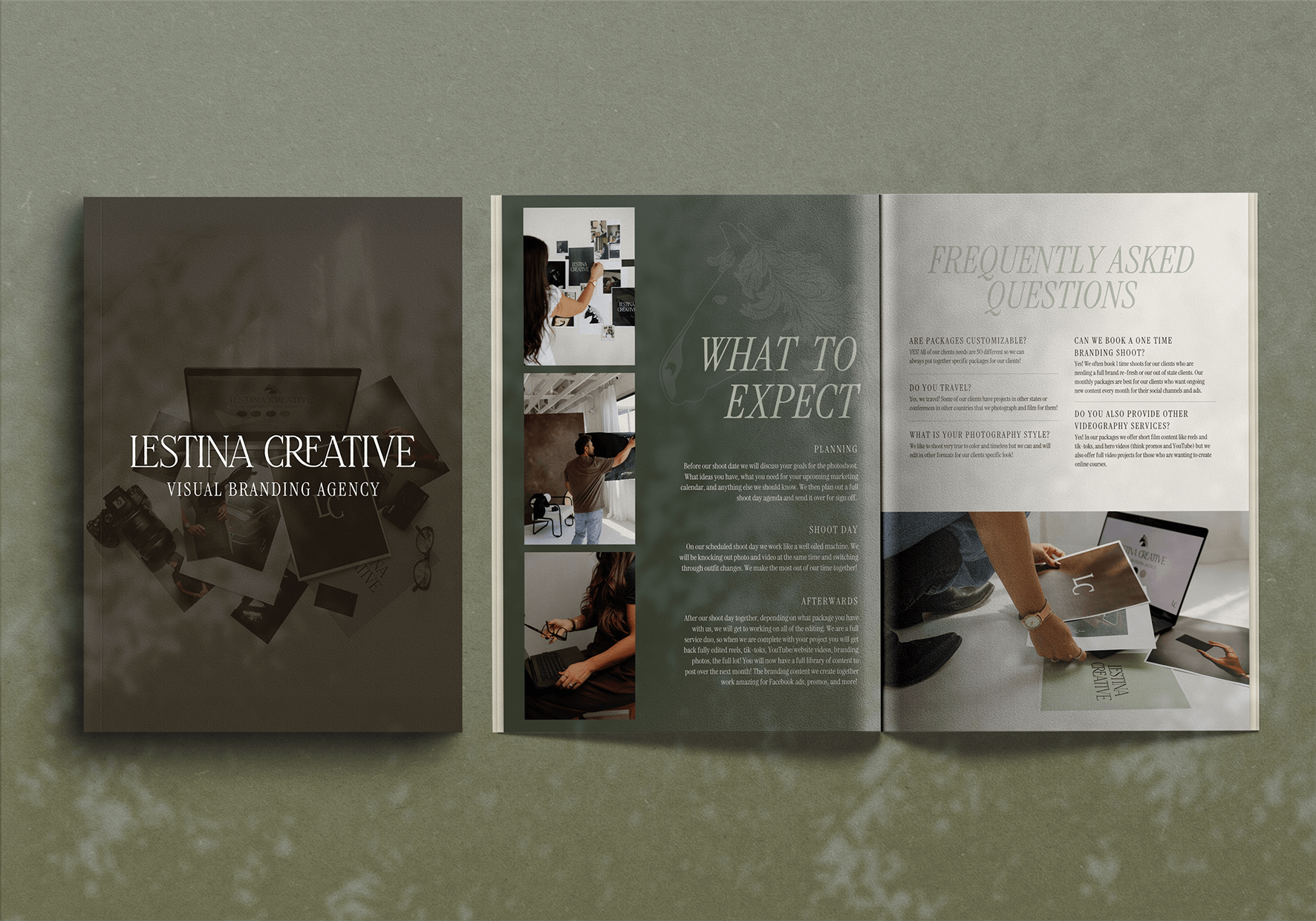
Brand Photography


Services Guide
After finalizing their branding Lestina Creative wanted their marketing materials to reflect the luxury look and feel of their new visual identity. They hired me to refresh their pitch deck/investment guide for their main service stack and their additional services.
Using strategic design decisions, I elevated their pitch deck from a DIY Canva template to a fully branded, high-end guide that could be refined and customized for each pitch.
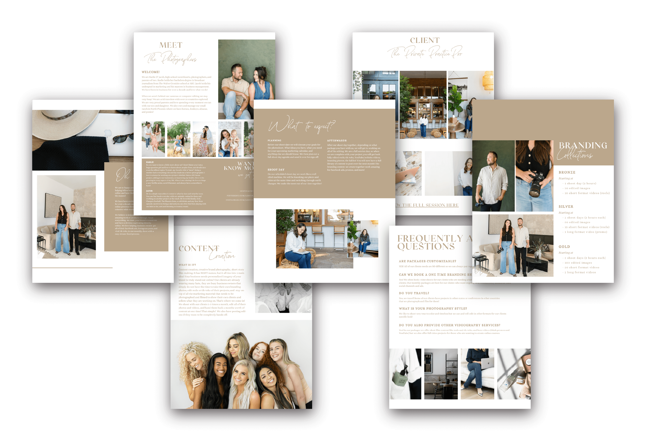
BEFORE
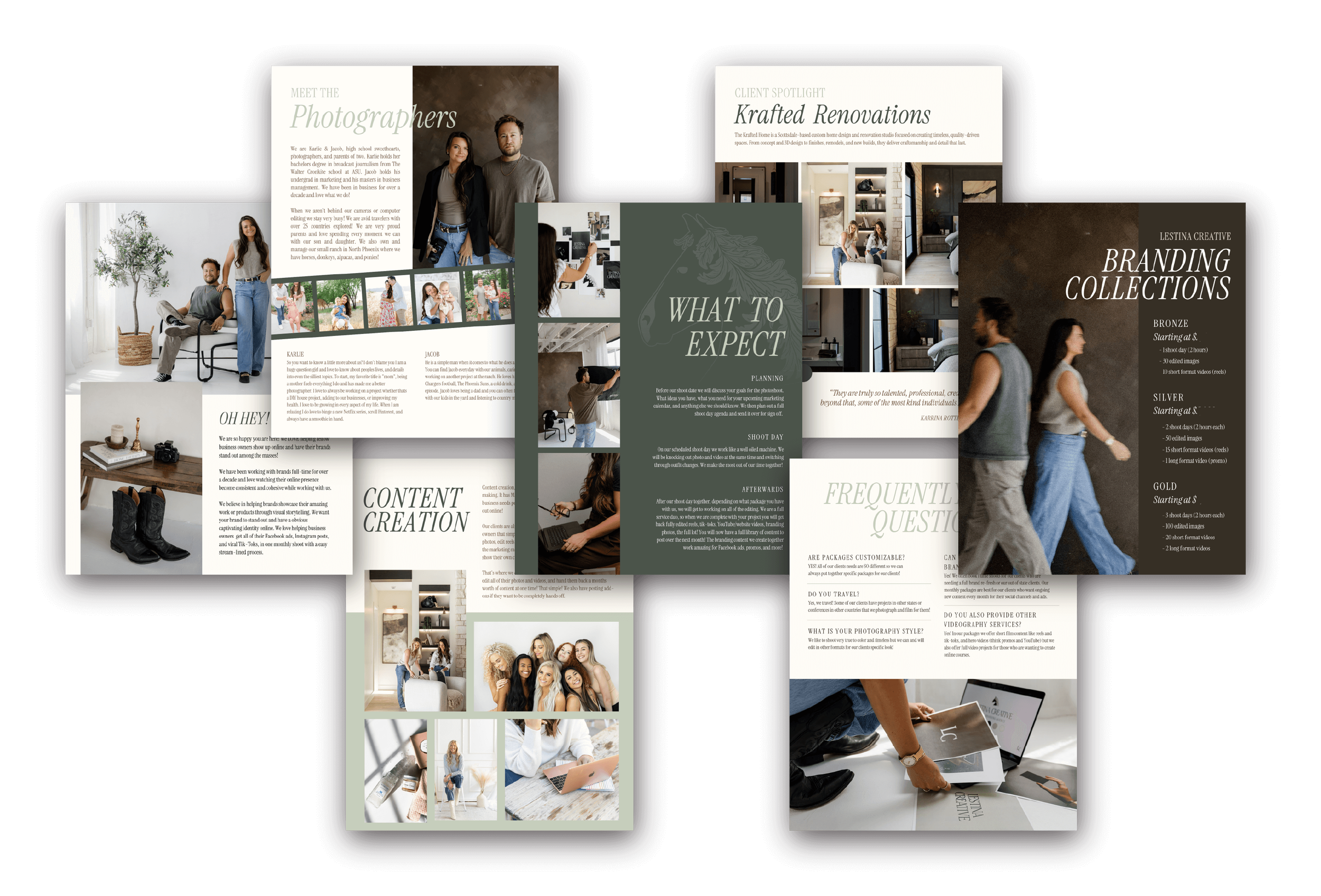
AFTER